Every canvas tote bag is a mobile brand statement, a walking cultural symbol. Color is the most direct and impactful language of this declaration. We specialize in custom canvas tote bags that span the entire spectrum, helping our global clients to precisely embed their unique brand philosophy into every meticulously crafted bag. Color is the silent language that builds emotional connections with your brand. The right color choice instantly conveys a company’s core values and personality. Whether you aim to project a professional image of stability and reliability or communicate a spirit of vibrant innovation, our extensive color library offers the ideal solution. Let us assist you in finding the perfect color to tell your brand’s story.
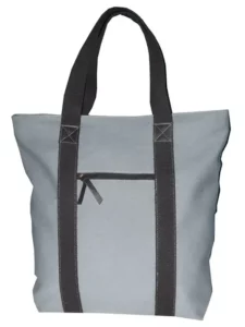
Classic & Powerful: The Professional Palette for Canvas Tote Bags by Color
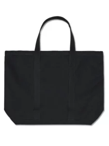
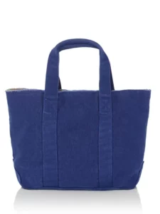
We recommend our classic color collection for brands pursuing professionalism, stability, and trustworthiness. A black canvas tote bag is a choice of timeless elegance, symbolizing authority and sophistication. Grey conveys calm, balanced modernity, while royal blue represents wisdom, trust, and expansiveness, making it a top choice for many tech and financial institutions. These colors not only suit high-level business conferences but also enhance your brand’s professional gravitas in the eyes of your clients.
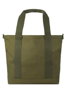
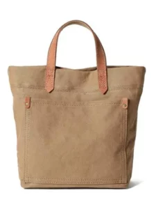
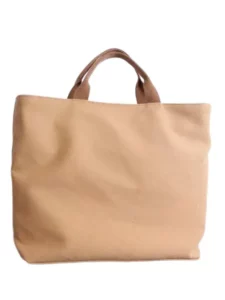
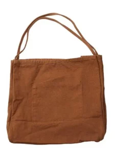
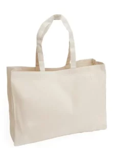
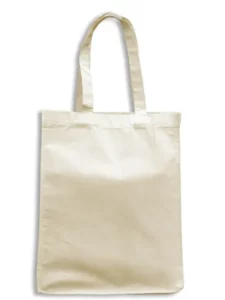
Natural & Harmonious: The Earthy Palette for Canvas Tote Bags by Color
Our earthy tones will resonate perfectly when your brand champions a natural, healthy, and sustainable lifestyle. Each color feels drawn from nature, from deep dark green and tranquil olive green to warm brown and rustic khaki. Tote bags in these shades are especially suited for organic products, outdoor gear, or any brand promoting an eco-friendly philosophy, conveying a message of authenticity and sincerity to the world.
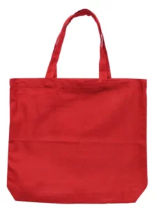
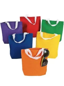
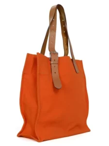
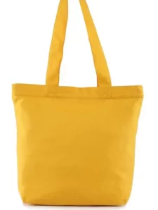
Vibrant & Passionate: The Bright Palette for Canvas Tote Bags by Color
Bright colors are undoubtedly the best choice if you want to capture attention instantly at marketing events or inject your brand with youthful, optimistic energy. Passionate red can spark consumer desire, cheerful yellow radiates positivity and creativity, and vibrant orange symbolizes friendliness and fun. These vividly colored canvas tote bags are ideal carriers for seasonal promotions, product launches, or youth community events.
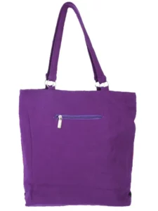
Elegant & Unique: The Refined Palette for Canvas Tote Bags by Color
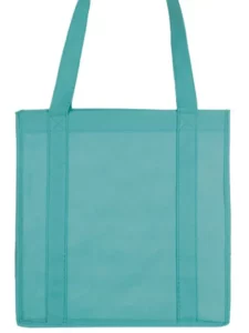
We also offer chic color options for those looking to cultivate a unique, sophisticated, or artistic brand image. Soft cream and beige convey simplicity and elegance; mysterious purple implies creativity and luxury; and fresh teal is distinctive. These unique colors can help your brand distinguish itself from the competition, becoming that unforgettable highlight in your clients’ minds.